
If you’ve ever printed a document or an image full of rich colors, at times you have likely thought, “Why don’t the colors on my printed piece match the colors on my computer monitor?” Unfortunately, your printer is not to blame. Upgrading to a more expensive or higher-quality device won’t solve this issue. While the paper and ink you use to print can play a role, regardless of what paper and ink you use. The reality is you’re unlikely to ever get a perfect match between the colors on your paper and your monitor. Why? Because the image you see on your screen and the image printed on a piece of paper are created by two completely different mediums.
Color Difference Between Monitor and Printer
To explain, the difference between printed images and images on a computer monitor in the simplest terms possible is, it’s all about light. The fact is, you can’t print light. Images on a monitor are composed of light-emitting diodes in the form of pixels. However, printers work with paper, which is not made up of light and pixels. Printers are forced to work with dyes and pigments to replicate colors on paper. Each device uses different technology to create the finished product. This sometimes results in the mismatching of colors.
RGB vs. CMYK
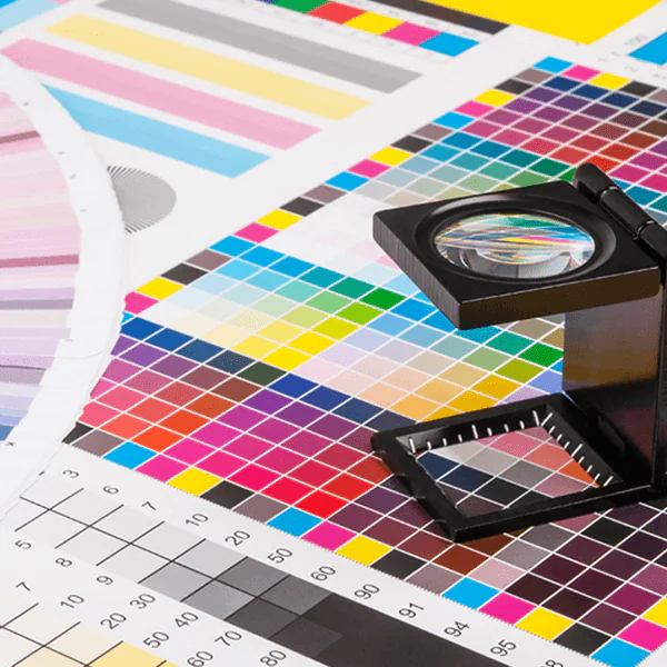
Computer monitors use RGB color modes to create colors on the screen. On the contrary, printers rely on CMYK color modes to put colors on the paper. RGB mixes the primary colors of red, green, and blue in different quantities to create the colors on your screen. The RGB gamut is composed of every color that exists in light; therefore, the pixels on a monitor can each display close to 17 million colors.
On the other hand, CMYK creates color by combining four base colors: cyan, magenta, yellow, and black in varying degrees. This limits the distinct colors that can be created using CMYK to only a couple of thousand. Colors from your monitor are being converted from RGB to CMYK during the printing process. Because of CMYK’s limited color options, oftentimes the printed colors will be duller and darker than those you see on your screen.
Due to the technology they rely on to print, printers cannot replicate all the colors a monitor can display.
Frequently Asked Questions About Color Matching Between Screen and Print
Why do my printed colors look different from what I see on my monitor?
Your monitor displays color using light – combining red, green, and blue (RGB) to produce millions of colors, including many that are vivid and luminous. Printers work differently, mixing cyan, magenta, yellow, and black (CMYK) inks on paper. Because these are fundamentally different systems, some colors you see on screen simply cannot be reproduced in print with the same intensity. The gap is most noticeable with bright blues, electric greens, and saturated oranges.
What is the difference between RGB and CMYK, and why does it matter for printing?
RGB is an additive color model – it starts with darkness and adds light to create color. CMYK is a subtractive model – it starts with white paper and adds ink layers that absorb light. Designing in RGB and then printing without converting to CMYK first is one of the most common causes of unexpected color shifts. If color accuracy is important to your output, always design in CMYK or convert your files before sending them to print.
How can I calibrate my monitor to get more accurate color previews?
Monitor calibration tools, sometimes called colorimeters, measure the actual colors your display produces and create a profile that corrects for its particular characteristics. Most operating systems also include basic display calibration utilities that let you adjust brightness, contrast, and white point. For everyday office printing, even a basic calibration improves consistency. For high-stakes print work – such as marketing materials or branded collateral – a hardware calibration tool is worth the investment.
When does color accuracy matter most, and when is it less critical?
Color accuracy is most important for brand-sensitive materials like logos, product photos, and marketing pieces where consistency across print and digital channels is expected. It matters less for internal documents, draft proofs, or text-heavy reports where a slight color shift does not affect the reader’s experience. Understanding which print jobs require tight color control helps you allocate resources wisely and avoid over-engineering the process for routine output.
What can a print technology provider like Doceo do to help with color consistency?
Doceo can assess your current print environment and recommend devices that are well-suited to your color accuracy requirements. Many modern multifunction printers and production devices include built-in color calibration tools and support ICC color profiles, which help narrow the gap between screen and print. Beyond equipment, Doceo’s support team can advise on print driver settings, paper selection, and workflow adjustments that make a real difference in day-to-day color output quality.
How to Match Print Color to Screen
There are things we can do to get closer to a match. Calibrating your monitor regularly can help ensure that you’re seeing colors correctly when you start. Then, working in the correct color space for your end product (RGB for online views, CMYK for print) is key. Finally, utilizing software tools for soft proofing or printer profiles can help predict how colors will reproduce in print. It takes a little effort, but these steps will bring your printed colors ever closer to what you see on screen.
So next time your printer fails to match the color you see on your computer screen, don’t blame the device. Copiers and printers do the best they can with the 4 colors that they were built to work with.